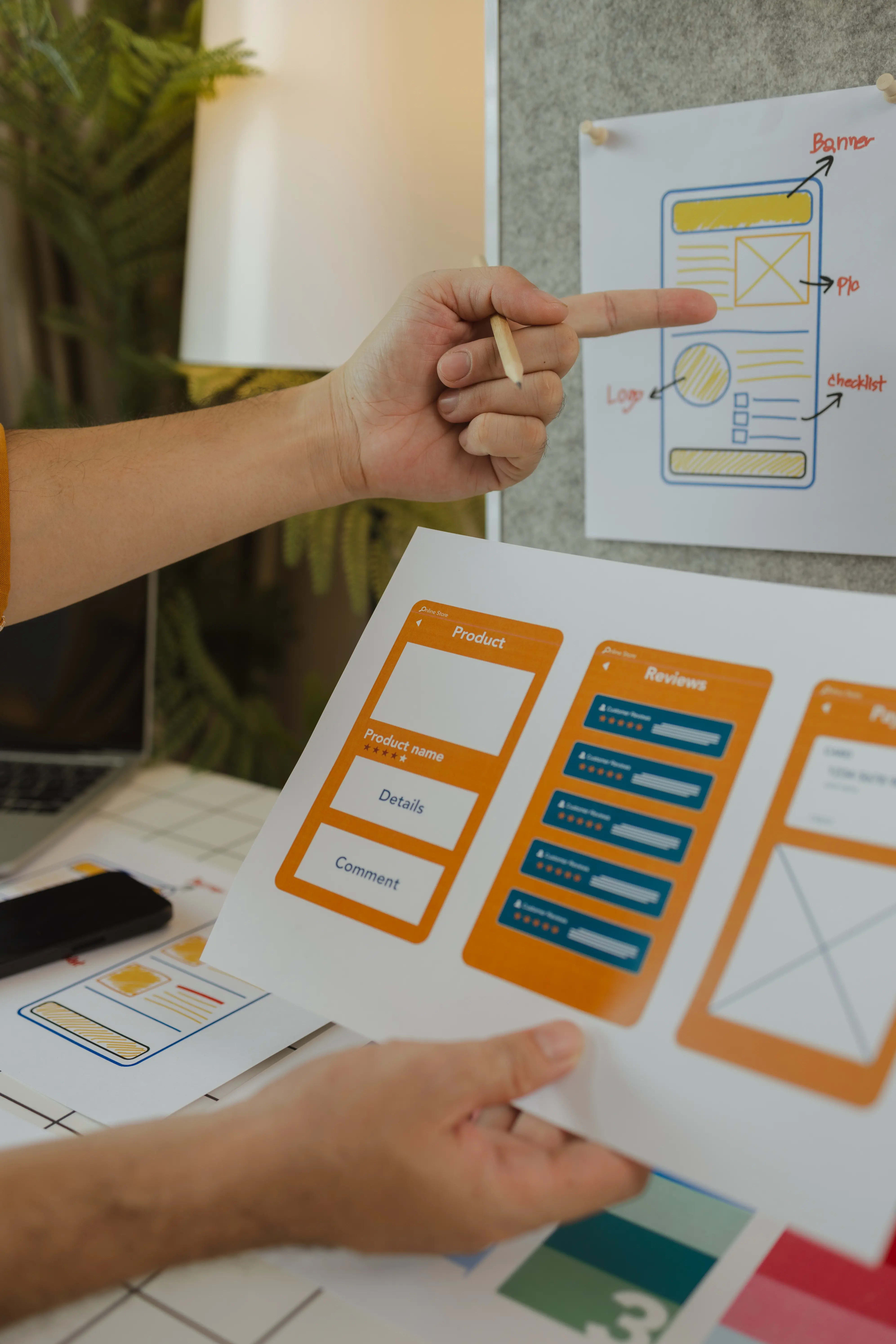
In Costa Rica’s competitive digital market, good-looking websites often fail because they’re not built for action. A truly high-converting site blends design, psychology, and user experience to guide visitors toward clear goals — from contacting you to completing a purchase. Here’s what works, what doesn’t, and how to apply it locally.
It’s more than colors and layout. A conversion-focused site is intentionally structured to guide users toward specific actions: calling you, booking a service, purchasing, or initiating a WhatsApp chat. Every design decision supports a measurable business outcome.
Words influence action. A button labeled 'Book My Spot' creates urgency and clarity compared to a generic 'Submit'. Microcopy, headlines, and form labels should all guide the user toward the next step with language they understand and trust.
| Element | High-Converting | Low-Converting |
|---|---|---|
| Hero section | Clear headline + benefit + visible CTA | Generic slogan with no CTA |
| Navigation | Simple, few key links | Overloaded with dropdowns |
| Forms | Short, 3–5 fields max | Long, complicated forms |
| Mobile UX | Thumb-friendly buttons, fast load | Slow, hard-to-click elements |
| Trust | Testimonials, case studies, guarantees | No visible proof or social proof |


A high-converting website builds trust, guides users, and gets them to take action — every time.
The Agency Costa Rica
We combine heatmap analysis, A/B testing, and real user feedback to refine designs until they’re conversion-optimized. Our builds are mobile-first, SEO-ready, and loaded with clear CTAs and local trust signals — so your site doesn’t just look good, it works for you 24/7.
We’ll review your site’s design, speed, and conversion flow within 48 hours.
In Costa Rica’s market, design without conversion thinking leaves money on the table. By combining clear messaging, mobile speed, trust elements, and strategic UX, you can turn more visitors into paying customers.
